Web / UX / CRO
Rebuilding a MedTech website for its first commercial markets
Tight Alright became commercially available in Switzerland in October 2025 and in the USA in March 2026. I rebuilt the FeelTect website around the audiences who now needed to understand, trust and act on a complex MedTech proposition.
- Role
- Marketing Intern, working across marketing, clinical and leadership stakeholders
- Timeline
- September 2025 to June 2026
- Scope
- Information architectureUXConversion rate optimisationCopywritingWordPressElementor ProSEO
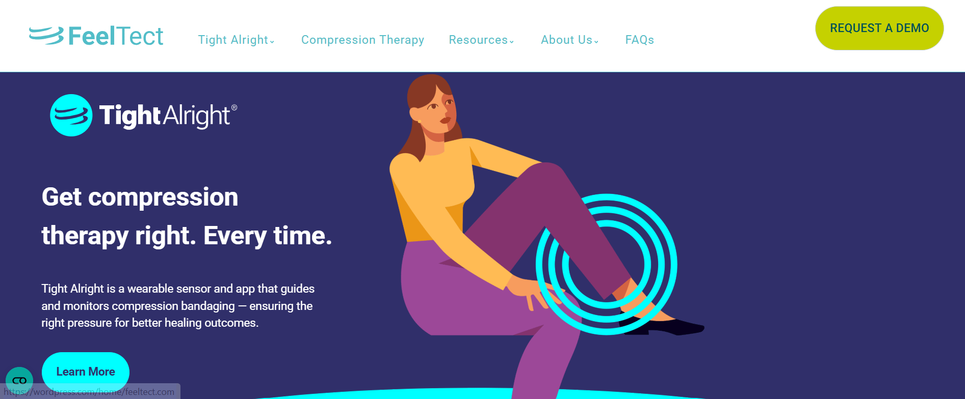
- Pages built and shipped
- 6Pages built and shipped
- Increase in social channel visitors
- 88%Increase in social channel visitors
At a glance
- Project
- Rebuilt and expanded the FeelTect website during the company's transition into its first commercial markets, with clearer communication, stronger information architecture and more purposeful user journeys.
- My role
- UX audit, information architecture, content structure, copywriting, website build, CRO and SEO implementation.
- Key outputs
- Six pages built and shipped in WordPress and Elementor Pro, no external developer
- Information architecture restructured around audience needs
- Trust signals integrated at the right points in the journey
- Clearer calls to action and conversion pathways
- On-page SEO implemented during the build
- Cookie consent implemented for GDPR compliance
- GA4 and Google Search Console supporting measurement and monitoring
- Primary result
- 88% increase in social channel visitors
Tech stack
Tools used
 WordPress
 Elementor Pro
 Google Analytics 4
 Google Search Console
01 · The context
A website that suddenly mattered more
FeelTect was moving from an earlier-stage technology proposition into its first commercial markets. Tight Alright became commercially available in Switzerland in October 2025 and in the USA in March 2026, the first markets where the product could actually be purchased.
That changed the website's job. It could no longer simply introduce FeelTect and its technology. It had to help a healthcare professional understand the clinical problem, how Tight Alright works and the evidence behind it, while helping partners and stakeholders see what FeelTect was doing, where it was active and how to engage.
The site had to explain, educate, build credibility, guide and convert, all without overwhelming the visitor. And with no external developer involved, I had to carry the marketing and UX requirements through to practical implementation myself using a no-code workflow.
02 · The problem
The website made visitors work too hard
The existing website held useful information, but the experience did not make that information easy to find or understand. Important content was not prioritised around the questions a visitor was likely to arrive with, and a specialist clinical proposition was being explained technology-first.
Different audiences arrived with different objectives, yet the pathways for product information, clinical content, events, testimonials, educational material and enquiries were underdeveloped or fragmented. Calls to action and trust signals needed more purposeful placement, and the on-page SEO foundations needed strengthening.
So the response was a restructuring of the digital experience around audience questions and decision-making rather than a visual redesign.
BeforeAfter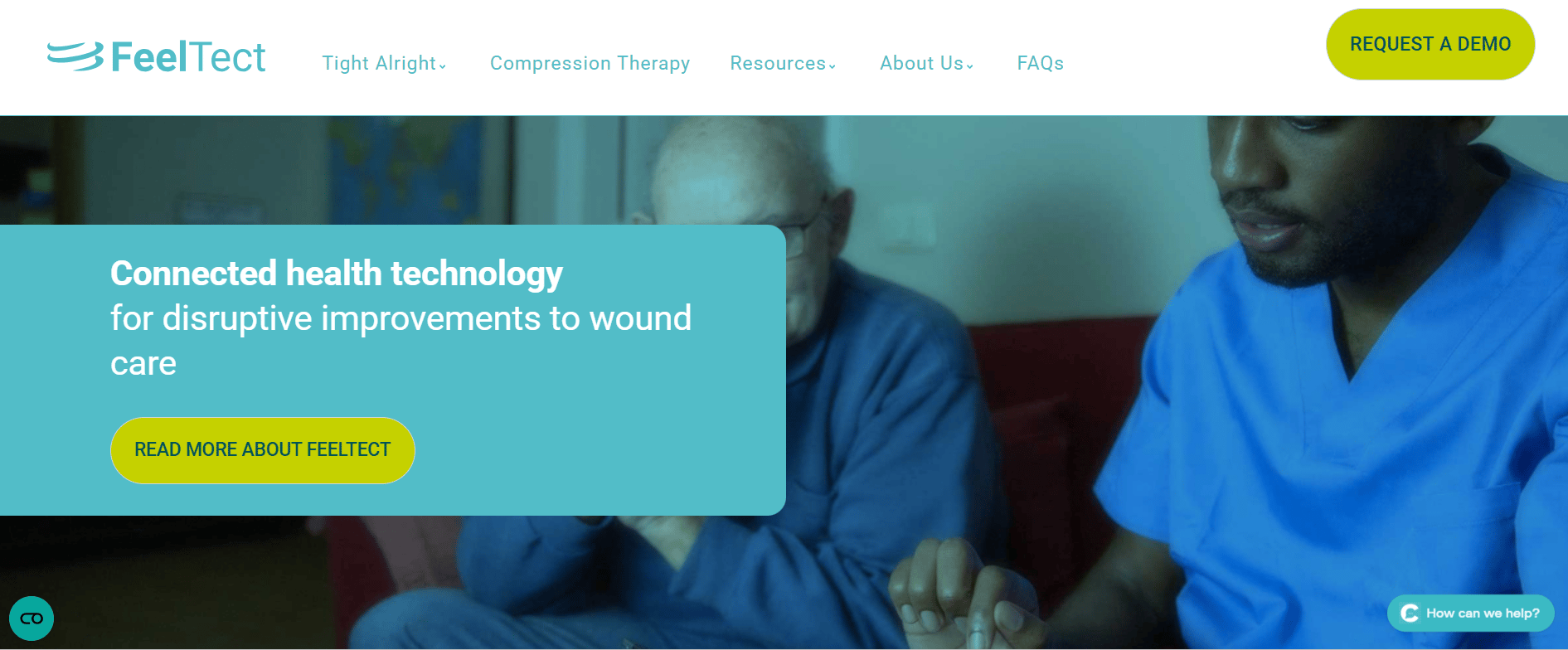
03 · The audiences
Different visitors arrive with different questions
Healthcare professionals need to understand the problem, the product, its clinical relevance and the supporting evidence, so clinical information had to be accessible without burying the core proposition under technical detail. Their journey runs problem, solution, evidence, confidence, action.
Clinical stakeholders and partners care about FeelTect's technology, activity, events and opportunities to engage, which makes broader company and activity content matter beyond a single product page. Investors and business stakeholders arrive with different requirements again, particularly around the company and the commercial opportunity.
That set the key principle behind the rebuild: accommodate different information needs without creating disconnected experiences. The architecture had to help each visitor self-select the information most relevant to them.
04 · UX strategy
From company information to visitor journeys
I structured the experience around four stages. Awareness: the homepage establishes who FeelTect is, what problem it addresses and what Tight Alright does. Understanding: product, educational and supporting content answer how it works, why it matters and where it is used. Credibility: clinical information, testimonials and trust signals sit inside the journey rather than off to the side. Action: once a visitor has enough information and confidence, the next step is obvious.
The information architecture was expanded and reorganised around what visitors needed to access, with dedicated destinations for product information, events and conferences, testimonials, educational content, careers and conversion-focused enquiries. Every new page had a defined role in the journey.
Navigation was organised around what a visitor would reasonably want to find rather than FeelTect's internal structure, and content consistently followed the sequence problem, solution, explanation, evidence, action. For a complex healthcare proposition, asking someone to understand the technology before the problem creates unnecessary cognitive load.
05 · UI and visual design
Making a complex proposition easier to process
The interface work served the UX strategy. Headings, sections and supporting content were structured so visitors could scan pages before committing to deeper reading, with important messages, evidence and calls to action given appropriate prominence.
Consistent typography, spacing and section structures created a predictable experience across pages, product and brand imagery made the technology tangible, and reusable Elementor components kept the build consistent. Layouts were adapted across desktop and mobile breakpoints so the information hierarchy held on every screen size.
The visual system supported three priorities: clarity, credibility, conversion.
06 · No-code execution
Turning strategy into a functioning website
There was no external developer building the pages, so I translated the marketing strategy, UX structure and content requirements into a functioning website myself: WordPress as the CMS, Elementor Pro for layouts and reusable components, GA4 for measurement and Google Search Console for indexing and search visibility.
I developed my Elementor capability early in the placement and used it to build and ship six pages, moving through the complete chain from marketing objective and audience need to UX structure, content, UI execution, build and measurement. I also implemented cookie consent to ensure the website met GDPR requirements before analytics tracking went live.
6
Pages built and shipped without an external developer
07 · Content and messaging
The copy became part of the UX
The architecture only worked if the content answered the questions visitors were actually trying to solve. Compression therapy is a complex clinical area, so leading with technical product claims would ask visitors to understand the technology before understanding why it matters. The product messaging opens with the underlying problem instead.
One example: you can't optimise what you can't see. From there the product is introduced as the answer, through live pressure tracking during application, continuous monitoring across the treatment cycle and objective data for clinical decision-making. The sequence runs recognise the problem, understand the limitation, meet the solution, understand the value, consider the next step.
The order of the copy was deliberate throughout. Problems came before detailed product explanation, benefits connected to user needs, evidence appeared where it could support credibility, and CTAs followed sufficient context.
08 · Conversion and CRO
Designing for meaningful next steps
CRO here meant understanding where a visitor might need extra information or reassurance and providing an appropriate next step, with trust signals positioned inside the journey to reinforce what was being presented.
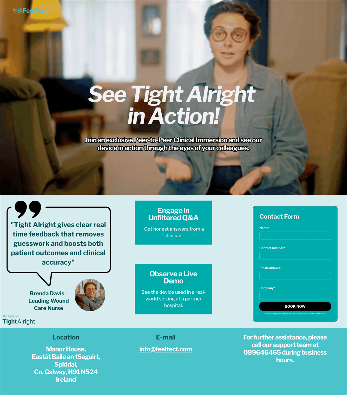
The clearest example is the standalone landing page for the Tight Alright peer-to-peer clinical immersion programme. Rather than routing visitors through the general website, the page created a focused experience running programme value, testimonial, action, form, which cut unnecessary navigation and gave visitors a clean path to the intended action.
I do not claim a specific conversion uplift from this work, because sufficient downstream conversion data was not available to establish one.
09 · SEO and discoverability
Making information easier to find
SEO went in while the pages were being built: heading hierarchy, metadata, image alt text, internal linking, page structure and content organisation. Google Search Console monitored indexing and showed which queries the website surfaced for.
This mattered as FeelTect entered commercial markets. The website had to communicate well once someone arrived, and it also had to be discoverable by the audiences searching for the information in the first place. I have not claimed a specific ranking improvement, because I do not have the evidence to attribute one directly to the rebuild.
10 · Measurement
A measurement foundation under the experience
GA4 tracked the website while Google Search Console covered search performance and indexing, creating visibility across traffic, engagement, acquisition sources, page performance and search queries.
One documented outcome during the project period was an 88% increase in social channel visitors. The website operated alongside FeelTect's wider social, content and marketing activity, so I present that figure as a wider digital marketing indicator and make no claim that the rebuild alone caused it.
88%
Increase in social channel visitors during the project period
11 · The pages
Six pages built and shipped
The build produced a homepage with a clearer product-led entry point, a dedicated events and conferences destination, a careers page the site never had, a home for the 15-episode educational video series, a testimonials page carrying clinical trust signals, and a focused conversion landing page for the clinical immersion programme.
Screenshots flatten a website, so these are screen recordings of the pages as they shipped. Judge the scroll rhythm, the information order and where the trust signals landed.
12 · Tools & tech stack
What the work ran on
Web: WordPress, Elementor Pro.
Measurement: Google Analytics 4, Google Search Console.
Content and creative: copywriting in-house, imagery from the FeelTect brand system.
13 · What changed
Information structured around audience needs, journeys with purpose, trust signals inside the experience, SEO in the foundations, and a website ready for a company selling in real markets.
- Pages built and shipped
- 6Pages built and shipped
- External developers required
- 0External developers required
- Increase in social channel visitors
- 88%Increase in social channel visitors
Reflection
What I learned
A website can look professional and still create unnecessary friction. The most important improvements came from asking what the visitor needs to know, what question they are trying to answer, what evidence will earn their trust, and what they should do next.
When a product is difficult to explain, information architecture becomes part of the marketing strategy. The order of the content decides whether someone understands the problem before being asked to understand the technology.
I did not need to be a traditional developer to own the digital experience. With WordPress and Elementor Pro I could carry the work from strategy and content through UI implementation and measurement, which turned the website into commercial marketing infrastructure rather than a digital brochure.