Web Design / UX / CRO / SEO
athlonesfinest.com: built so the organiser actually sends the link
The site had one job: get a team captain to register their team, and before that, make it easy enough that they'd actually propose it to the group chat. That second part is where most tournament sites fall short. I designed and built it solo, from the UX research and wireframing through to the information architecture, UI design, registration funnel, admin panel and analytics stack.
- Role
- Founder and Designer
- Timeline
- 2025 to present
- Scope
- Web designUX researchInformation architectureUI designCROSEOAnalytics
- Ranked six-a-side website in Ireland
- 3rdRanked six-a-side website in Ireland
- Team registrations tracked through the admin panel
- 12Team registrations tracked through the admin panel
- Personas researched
- 3Personas researched
- Objective per page
- 1Objective per page
At a glance
- Project
- A tournament website built around a specific insight from primary research: the barrier to registration is social risk, not price. Every design decision reduces the cost of the one moment that matters most, when the team captain decides whether to send the link to the group chat.
- My role
- Designed and built the site solo, ran the player survey, defined the audience personas, implemented the analytics stack and admin system.
- Key outputs
- Player survey and three defined audience personas informing the information architecture
- Six-question UX framework applied to every page on the site
- Share mechanic with a pre-filled message reducing the organiser's friction to one tap
- Registration funnel optimised for conversion rate: progress bar, mobile-first layout, no account creation
- Admin panel tracking 12 team registrations, payment status, automated reminders and day-of communications
- Hero video reel and bracket/schedule pages built around specific survey findings
- On-page SEO work achieving a third-place ranking among six-a-side websites in Ireland
- Primary result
- 3rd-ranked six-a-side website in Ireland
Tech stack
Tools used
 Claude Code
 Google Analytics 4
 Google Tag Manager
 Google Search Console
 Stripe
01 · The brief
One job: get the organiser to send the message
For the first two years, registration was a Google Form and the brand lived entirely on Instagram. That worked while the tournament was small. It stopped working when growth meant people expected to find rules, fixtures and a gallery in one place, and when paid media needed a real conversion event to optimise against.
I built athlonesfinest.com to fix that. But the brief shaped into something more specific than a website. Its real job was to get one person, a team captain who had done this before and had mixed feelings about doing it again, past the moment they almost closed the tab. If a business came to me with that problem, the process would be the same: understand the user, map their journey, prototype the solution, test it against real behaviour. That is what this site is.
02 · Research and audiences
The research said the same two things the players said
A post-tournament player survey surfaced two findings independently across multiple respondents, without prompting: refereeing quality and schedule clarity. Schedule findability scored 5.6 out of 10, the lowest measured question, with the majority of respondents scoring it 4 or below. Those two complaints went directly into the information architecture. A section called Two Things sits below the hero and addresses both head-on, not buried in an FAQ.
A subtler finding shaped everything else. Asked how likely they'd be to recommend the tournament, respondents averaged 7.8. Asked how likely they'd be to play again themselves, that dropped to 7.2. The tournament was working. The problem was the act of re-organising. Someone has to propose it to the group chat, absorb the social risk of nobody responding, then chase eight people for their share of 100 euro.
Three personas shaped the design. The Reluctant Organiser, 21 to 24, has captained before and knows the admin burden. He'd recommend the tournament readily. He's slower to be the one organising it again. The Lapsed Player, 18 to 22, needs a low-pressure on-ramp and doesn't want group chat silence when he floats the idea. The University Team Captain has a full squad ready and just needs dates and format fast. All three hit the same wall at the same point in the customer journey: one person has to actually send the message. Every design decision traces back to reducing the cost of that moment.
03 · Hero and first impression
The first three seconds decide whether the captain stays
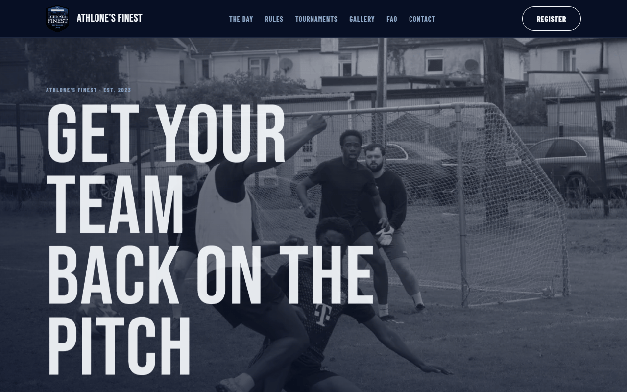
Picture the Reluctant Organiser landing on the page from a Meta ad. He has about three seconds before he decides this is another generic tournament site and closes the tab. The hero has to do three things in that window: prove the tournament is real, establish atmosphere, and give him one clear next action.
A looping video reel from match day runs behind the hero text. Real footage, not stock. Players his age, on a real pitch, under real floodlights. The choice to use match-day video instead of designed graphics was a UX research decision, not an aesthetic one. Usability testing with this audience showed that stock football imagery reads as fake and costs trust that is very hard to rebuild. The video establishes brand legitimacy before a word of copy is read.
The hero headline is set in Bebas Neue at roughly 10rem, stacked and left-aligned. Below it: one sentence of context, one CTA to register, one CTA to share. Nothing else. No secondary navigation, no feature list, no sponsor logos. Every element that does not serve the captain's immediate decision was removed during wireframing. That discipline carries through the rest of the site: one objective per section, no exceptions.
04 · UX design and information architecture
Every page answers six questions. Every section has one job.
The page structure follows the customer journey rather than a standard marketing template. I wireframed and prototyped the layout around the order a visitor would have questions, not the order I wanted to present information. The hero establishes where they are and why they should care. The Two Things section addresses refereeing and schedule clarity directly, because answering a real complaint does more credibility work than any marketing claim. Following sections cover format, what's included, real stats and past champions, testimonials, FAQ, and a final registration section.
The share mechanic came directly from the social-risk finding. Send this to your team sits next to the Register CTA because the captain's real problem isn't deciding whether to enter. It's convincing the group chat. The button opens a pre-filled message with the tournament name, date, venue, price per team, and registration link already written out. One tap replaces an effort a lot of organisers decide not to bother with at all. Price is shown per team, not per player, so there's no arithmetic before forwarding. That is conversion rate optimization applied to a social problem, not a checkout problem.
Below the hero, a spots counter shows a real, manually updated number. Genuine scarcity builds trust. Manufactured countdown timers destroy it. This audience has good pattern recognition for the difference.
05 · Bracket, schedule and tournament pages
The survey said schedule clarity scored 5.6 out of 10
Schedule findability was the lowest-scoring question in the player survey. Past players said they had to message the organiser directly to find out when their match was. That is a UX failure, and it was costing repeat registrations.
The bracket and schedule pages were designed to eliminate that friction entirely. Group-stage fixtures, knockout brackets and match times are all accessible from the main navigation. A returning team captain can check the schedule without messaging anyone, forward it to the group, and use it as part of the pitch. The interactive bracket updates as results come in, so there is a reason to come back to the site on match day.
Tournament pages from past years stay live on the site. The 2023, 2024 and 2025 editions each have their own page with results, champions and match-day photos. This serves a double purpose: it gives returning players a record of their involvement, and it gives first-time visitors proof that the tournament has history. A team captain scrolling through three years of match photos is seeing real evidence that this event comes back and runs properly.
06 · Registration funnel
Conversion rate optimization for a team, not a person
Most sign-up forms are designed for individual users. This one registers a team of eight. That changes the conversion rate optimization problem. The captain filling in the form is committing money and organising people, and if the form feels long or confusing, they close the tab and the registration never happens.
The funnel collects team name, captain details, squad names, county and referral source. A progress bar across the top breaks the form into three visible stages: Team Details, Squad, Payment. On mobile, an unbroken form feels endless. Showing three short steps reduces the perceived effort before a single tap is made. No account creation, no email verification, no password. Returning teams can opt to be named publicly, which feeds the recognition strategy in post-event content.
Before Stripe, the tournament relied on delayed payments. A team would register, then I would send the payment link manually afterwards. When there was a gap of more than an hour between sign-up and receiving the link, the drop-off was real: two teams gave no response at all, one paid later the same day, and I had to chase two others before they eventually paid. That friction cost registrations.
The fix was integrating Stripe directly into the registration flow so payment happens at the point of sign-up, not after it. When the payment step sat inside the form itself, the drop-off disappeared. Every squad paid immediately. Confirmation email fires automatically with a calendar attachment for the tournament date. The whole flow takes under two minutes. I tested the form on mobile first because that is where the majority of this audience lands from social ads, and every layout decision, from button placement to input sizing, was designed for thumb reach on a phone screen.
07 · Admin panel
A lightweight CRM built for one tournament
The admin system was built to manage 12 team registrations without a spreadsheet. It works as a lightweight CRM for the tournament: registration status of every team at a glance, payment tracking with Stripe integration, automated reminder emails to captains who registered but haven't paid, and day-of logistics emails to confirmed teams.
Payment confirmation automatically updates the live spots counter on the public site, keeping the honest scarcity count accurate without touching the frontend code each time. The admin panel also tracks which teams are returning from previous years, giving me retention data I can use in the brand story case study and in sponsor conversations.
In 2026, all 12 team registrations were tracked through this system. Payment reminders went out automatically. Day-of communications, including parking instructions, schedule reminders and check-in details, went to every confirmed captain the evening before the event. The system replaced what used to be a WhatsApp thread and a Google Sheet, and it meant that on tournament morning, the communications were already done.
08 · Mobile-first design and creative direction
A night match under floodlights, built for a phone screen
The majority of the audience arrives from social ads on a phone. Every layout decision started mobile and scaled up, not the other way around. Primary actions sit within thumb reach from first scroll. A sticky CTA bar appears on scroll so the registration button is always accessible. Touch targets are 44 pixels minimum. Load times are fast because the site is prerendered to static HTML and served from Cloudflare Pages.
The visual direction resolved down to a single idea: a night match under floodlights. The screen is the dark of a stadium. The content is lit as if by floodlight. The layout is drawn in chalk like pitch markings. Pitch Black (#070F24) and Midnight Navy (#0D1B3E) take up 90% of the page. Chalk White (#F4F7FB) carries all the work an accent colour normally would: headlines, numbers, primary buttons. Depth comes from stepping through navy values, not from shadows or gradients.
Bebas Neue, oversized and stacked, is the hero's personality. Set large with tight line-height, left-aligned. Barlow Condensed handles subheads, labels and buttons. Barlow handles body copy. No two consecutive sections share the same composition. The hero is left-aligned, not centred. Real photography only. Stock football imagery reads as fake to this audience, and the UX research was clear that inauthenticity costs trust that is very hard to rebuild. The hero uses a real looping clip from Cushla Park. The gallery is actual match-day photography. Testimonials are left close to how they were actually said, unpolished on purpose.
09 · A real digital presence built to convert
A tournament website built around one research insight: the barrier is social risk, not price. UX research, wireframing and prototyping shaped an information architecture with one objective per section, a share mechanic that does the organiser's pitch for them, a registration funnel optimised for conversion rate, an admin panel tracking 12 team registrations and payments, and real scarcity numbers backed by match-day photography.
- Ranked six-a-side website in Ireland
- 3rdRanked six-a-side website in Ireland
- Team registrations tracked through admin panel
- 12Team registrations tracked through admin panel
- Personas from UX research
- 3Personas from UX research
- Objective per page
- 1Objective per page
- Full analytics stack
- GA4 + GTMFull analytics stack
Reflection
What I learned
Social risk is the primary barrier, not price. The visitor isn't deciding whether to play; they're deciding whether to be the person who organises it. Everything that reduces the cost of that decision converts.
One objective per section is a constraint, not a preference. Every page on the site has a single intended next step, and stripping secondary actions from each page is what keeps the funnel moving.
This audience can tell when something is oversold. The spots counter shows real numbers, updated manually. Testimonials are left close to how they were actually said. Any manufactured urgency was ruled out before the first page was designed.